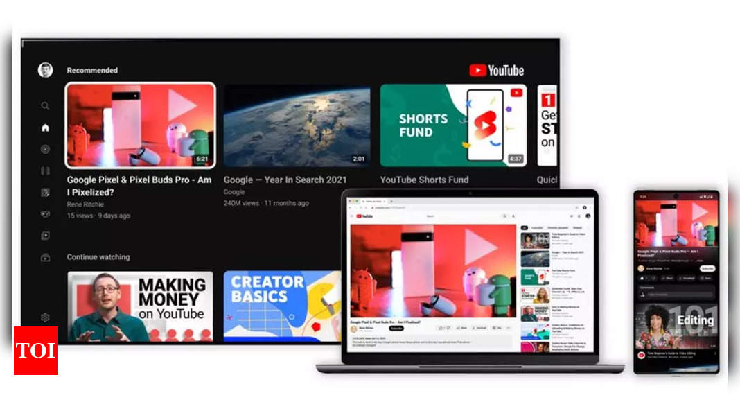
When will you get refreshed YouTube UI
YouTube says that it is rolling out “a new look and several features that offer a more modern and immersive viewing experience while also improving how users watch videos.” Since, these changes will gradually roll out to all users, you can expect the full rollout to complete over the next few weeks. Google also wants you to give feedback on the new design.
“Feedback from our creators and viewers has always played an integral role at YouTube as our teams continue to think of ways to improve for our users; today’s updates were no exception. We gathered input from thousands of viewers around the world and heard there was a desire for a cleaner, more lively design that better represents what we’re all about,” the company said in a statement.
Refreshed Ambient Mode
YouTube says that it used dynamic colour sampling to introduce a subtle effect so the app background colour adapts to match the video. The design is inspired “by the light that screens cast out in a darkened room” and YouTube wanted to recreate that effect in order to draw users’ focus into the content.
The ambient mode with subtle effect on YouTube will be available for users on the web and mobile in the dark theme.
Darker Dark Theme
Now that we are talking about the dark theme, YouTube is rolling out a tweak in the dark theme that makes it even darker. This is apparently done so that the colours “truly pop on your screen” and the grey elements on the watch page are now all back. It means that the darker dark theme will be seen not only around the video player but also video playlists and will show more details about each playlist.
This feature will roll out for users on web, mobile and Smart TVs.
Changes in watch page
YouTube says that it is bringing improvements in the watch page interface so that the users’ focus is on the video player. The first change is regarding video links. YouTube links in video descriptions will change to buttons and frequent actions, including like, share and download, will be formatted to minimise distraction. The subscribe button is also getting a new shape, high contrast and “it is no longer red.”
Pinch to Zoom and precise seeking
YouTube is now getting pinch to zoom along with precise seeking and it will be rolled out to all users. The feature was also available for some users as a part of experimental features.
An experimental feature in YouTube is a feature that is rolled out to a small group of premium subscribers to test. YouTube then measures how its users react to it and on the basis of the feedback, improvements are done to the feature. The pinch to zoom feature will be available on iOS and Android.
“Have you ever followed along to a tutorial on your phone, but needed to keep rewinding so you could master that one small step? Precise seeking helps solve this problem,” YouTube says about the new precise seeking feature. So whether you’re working on a desktop or a smartphone, you can now simply drag or swipe up while seeking to display a row of thumbnails in the video player. This will enable you to make fine-tuned adjustments to get to the exact part in each video.
YouTube says that the precise seeking feature builds on the already available video navigation tools that help users quickly find the parts that they are most interested in.
